Hello!
I'm Jui (Zoo-eey)
Hello!
I'm Jui (Zoo-eey)
API MANAGEMENT CENTER
Enhancing Admin experience to eliminate dependency on a User Manual
To comply with my non-disclosure agreement, I have omitted and obfuscated confidential information in this case study.
"Can you make this 10 page long Oracle form pretty?
We need the designs ASAP." said the PO
"Can you make this 10 page long Oracle form pretty?
We need the designs ASAP." said the PO
"Can you make this 10 page long Oracle form pretty?
We need the designs ASAP."
said the PO
"Can you make this 10 page long Oracle form pretty?
We need the designs ASAP."
said the PO
"Can you make this 10 page long Oracle form pretty?
We need the designs ASAP."
said the PO

"Can you make this 10 page long Oracle form pretty?
We need the designs ASAP." said the PO
Sounds familiar?
Every designer's story I guess.
7 months ago, my current product team reached out to me with a larger problem of protracted sales reported for Ethos - a suite of Ellucian products and a significant waste of R&D resources. And all they ask of me is to make the form look pretty?
What I was asked to do
What I inherited

SPOILER ALERT!
Well,
we did co-create 'pretty',
evidence based designs
by identifying the right problems to solve with some hiccups and bumps along the way.
See how we go there -
-
I was the UX lead on this project and our multidisciplinary team comprised of 11 - Developers, Architect, QA, PO and PM.
-
I was the sole individual responsible for User Experience design and I personally created the deliverables that you will see in this case study, excluding development and Ellucian's style guide elements.
-
I saw the project through from the kickoff meeting to the series of releases, and through multiple rounds of iteration afterward.
My Role
I had to not only solve for enhancing the Admins experience
but also advocate UX to get buy-in on the design recommendations from the stakeholders.
Challenge
UX doesn’t just serve users; it also serves businesses, and thus stakeholders.
KICKOFF - SETTING THE TONE OF THE PROJECT
This was a powerful step and I collected great insights by setting up 1-1 interviews with the PO, Principal Architect, PM, Director of Ethos.
Prior to the interview I sent out the following surveys to the stakeholders for them to come prepared and share their stories with me.
Stakeholder Interviews
Post a debriefing session here's what we defined -
PROJECT GOALS
Our higher level goals were -
1. Increasing the rate of Ethos Adoption
2. Reducing time investment in getting institutions Ethos Ready
3. Reducing the amount of troubleshooting customer complaints
SUCCESS MEASUREMENT
The metric we decided upon to measure our success was - measuring time to
task efficiency and compare it with the current delivery model.
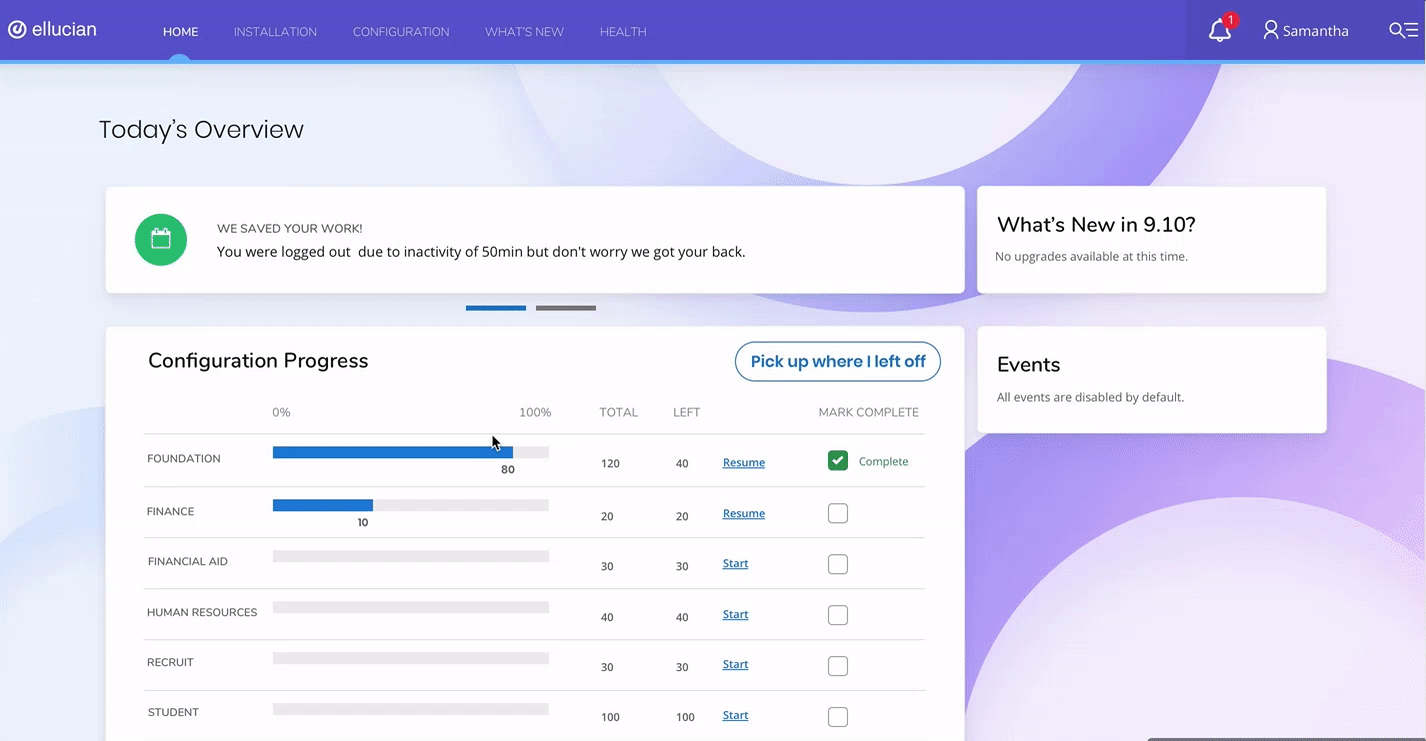
SCOPE (NEXT 6-9 MONTHS)
We created a roadmoap, which eventually ended up shifting a lot due to the
great insights collected from our users.
USER PAIN POINTS, OPPORTUNITIES
We identified some opportunities based on our assumptions about the
user pain points that we later validated through Contextual Inquiries.
Well, that went well! What next?
-
After we defined the scope of the project and the kickoff date, I knew I had planned to be at least 2 sprints ahead of their Agile Dev Sprints to be able to incorporate tons of User Research that would inform my designs.
-
I created a UX roadmap to align my design sprints with the Dev.
-
It really helped me not just stay on track but also to plan ahead and work efficiently along with the developers and Stakeholders.
Setting the stage
INTEGRATING UX INTO AGILE
Enhanced Efficiencies.
Better Decisions.
Improved Experiences.

COLLABORATION

Keeping Connected.
Deeper Relationships.
Better Conversations.
-
After we defined the scope of the project and the kickoff date, I knew I had planned to be at least 2 sprints ahead of their Agile Dev Sprints to be able to incorporate tons of User Research that would inform my designs.
-
I created a UX roadmap to align my design sprints with the Dev.
-
It really helped me not just to stay on track but also to plan ahead and work efficiently along with the developers and Stakeholders.
Setting the stage
INTEGRATING UX INTO AGILE
Enhanced Efficiencies.
Better Decisions.
Improved Experiences.
COLLABORATION
Keeping Connected.
Deeper Relationships.
Better Conversations.
From what I learnt from the stakeholders I found out about 2 user types
that are engaged in the installation and configuration of APIs.
1. Institutional IT Admins (Primary Users)
2. Ellucian Professional Services (Support Providers)
I led and conducted 4 remote Contextual Inquiries with the primary & secondary end users partnering with another designer to explore what problems were the professional services supporting the institutions with . My goal was to observe them go through their tasks as they naturally would and the workarounds they employed.
Getting to know the User

REMOTE CONTEXTUAL INQUIRIES
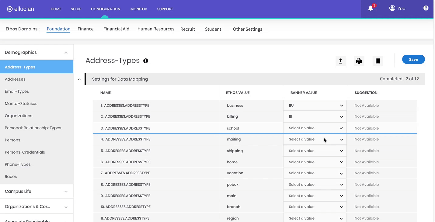
INSIGHT 1 - Missing Content Organization
There is no content hierarchy or search ability to look for a specific resource. The form lists 400 - 500 API settings that can be mapped or configured.
INSIGHT 3 - User Manual Is Mandatory
The users have to go through 3 documents - release guide, handbook and help to complete the mappings, and usually not without asking for help from Ellucian Professional Services.
INSIGHT 2 - Progress or Error Tracking
The form does not provide any information on how many configurations have been completed, and if there
are any required configuration settings.
INSIGHT 4 - Takes more than 35 hours
Troubleshooting takes up lot of time and prolongs the whole configuration process. Ellucian has to dispatch on-site professional services to resolve their issues on a regular basis thus wasting resources unnecessarily.
The stakeholders were aware that the ideal time to complete configuration process was 10 hours. Anything more than 15 - 20 hours was alarming.
We were surprised to see how disparate the whole experience was.
Eye Opener?
After sharing the insights with the stakeholders, it was time to involve them in the process of co creation and get a deeper understanding of the user.
Journey mapping workshop with the stakeholders

After sharing the insights with the stakeholders, it was time to involve them in the process of co creation and get a deeper understanding of the user.
Journey mapping workshop with the stakeholders
This graph illustrates the steps our users would go through when engaging with the product.
As a result of the Journey map, we learnt about another user type - the functional admins whose expertise in their domain was also a pre requisite in completing the configuration process.
Now we needed to map the touch-points for all the users to separate their role based tasks and interactions.
Third user's entry
Mapping User Touchpoints

How might we help institutions efficiently complete configurations without any help from Ellucian professional services or referring to a User Manual.
By this time, the developers had started to build a few features based on their understanding. No surprise there.
I patiently worked on a few rounds of iterations of the information architecture and content flows. I inherited an excel sheet of content inventory which made my job a tad easier to start consuming real data.
Content Organization


TESTING NAVIGATION STRUCTURES

We thought we had a winner, but...
After putting different navigation choices in a real use case, changed the scene and we realized that we now needed to test a few tasks with the users with more realistic data. Finally after another few rounds we really did have a winner that was built for the first release.
Context is king
STEP 1 - Usability Studies Round 1
I facilitated 5 usability sessions and invited our developers & stakeholders to observe and take notes. Major success! Watching our users go through the task, there was an immediate realization of the need of 'Contextual Search' that I originally had in my designs. Well, better late than never.
Our user have to navigate through 400-500 resources approximately, and remembering their path was their most dreaded thing. Their first natural instinct was to look for search.
Support insights with evidence
STEP 2 - FEATURES AUDIT

FREQUENCY/ADOPTION
I analyzed features in terms of frequency and adoption
(amount of people using them), and put them on this matrix.
STEP 3 - EFFORT AND VALUE ANALYSIS

Analyze & prioritize features in terms of development efforts and the value it adds in the users experience
RELEASE 1.0
Something was missing though, something I designed did not get built. (Something = Search)
You can’t get everything you want.
But, I had a process for triaging the things that are deal breakers from the nice-to-haves.
From ambiguous to obvious


Let the user know whats going on.
Let the user know whats going on.
Progress tracking and an
opportunity to return to where they left off, before a break.
BASIC FUNCTIONALITY
WORKED AS EXPECTED
How do you know when a
design is finished?
PROJECT UPHOLDS DESIGN PRINCIPLES AND GUIDELINES
PROJECT GOALS ARE ACHIEVED
USER FEEDBACK : Gold standard for evaluating a product

All Videos
Researcher : What’s your overall impression of the design? (Post test question)
User : “They’ve done a really good job of taking all the feedback and all the inputs we’ve been giving. And the UI is really nice, there’s a lot of information they had to pull together and its miles apart from what we used to do with GORICCR.”
PROBLEMS AND IMPROVEMENTS ARE HARD TO FIND
Note: Perfection isn't a goal
MY DESIGN COMPLETE CRITERIA
RELEASE 2.0
-
Product Roadmap shifted around a bit, but post 3 rounds of Usability tests + 2 releases we had pretty happy users already.
-
Happy Users = Happy Stakeholders
-
Positive results and much more to do.
The Impact
